
Blog
Enhancing Mobile Navigation: The Tactile WordPress Mobile Menu
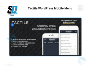
Tactile WordPress Mobile Menu
In today’s mobile-first world, a seamless and intuitive mobile navigation experience is crucial for any website’s success. As mobile devices continue to dominate web traffic, ensuring that your WordPress website is easily navigable on smaller screens is paramount. The “Tactile WordPress Mobile Menu” emerges as a powerful solution, offering a user-friendly and visually appealing mobile menu that enhances the overall mobile experience.
The Importance of Mobile Navigation
Mobile users expect a fast, efficient, and intuitive browsing experience. A poorly designed mobile menu can lead to frustration, increased bounce rates, and decreased engagement. Key considerations for mobile navigation include:
- Ease of Use: Mobile menus should be easy to access and navigate with touch gestures.
- Clear Hierarchy: Menu items should be organized logically, allowing users to quickly find the information they need.
- Visual Appeal: The menu should be visually appealing and consistent with the website’s branding.
- Performance: The menu should load quickly and function smoothly on all mobile devices.
Introducing the Tactile WordPress Mobile Menu
The Tactile WordPress Mobile Menu is designed to address these challenges, providing a responsive and user-friendly mobile navigation solution. It transforms the standard WordPress mobile menu into an interactive and visually engaging experience. This type of menu is generally provided via a plugin that enhances the default mobile menu experience.
Key Features and Benefits
The Tactile WordPress Mobile Menu offers a range of features that enhance the mobile navigation experience:
- Touch-Friendly Design:
- The menu is designed with touch gestures in mind, making it easy for users to navigate with their fingers.
- Large, easily tappable menu items ensure a smooth and intuitive experience.
- Customizable Appearance:
- Customize the menu’s appearance to match your website’s branding, including colors, fonts, and icons.
- Create a visually appealing and cohesive mobile navigation experience.
- Responsive Layout:
- The menu adapts seamlessly to different screen sizes and orientations, ensuring a consistent experience on all mobile devices.
- Provides a fluid and responsive navigation experience.
- Smooth Animations:
- Incorporate smooth animations to enhance the user experience and create a more engaging navigation flow.
- Adds a layer of polish and sophistication to the mobile menu.
- Icon Integration:
- Add icons to menu items to improve visual clarity and enhance the user experience.
- Icons can help users quickly identify and navigate to specific menu sections.
- Search Functionality:
- Integrate a search bar directly into the mobile menu, allowing users to quickly find specific content.
- Enhances content discoverability and improves user engagement.
- Off-Canvas Design:
- Implement an off-canvas menu design, which slides in from the side of the screen, providing a clean and uncluttered interface.
- Maximizes screen real estate and enhances the overall user experience.
- Multiple Menu Styles:
- Offer various menu styles, such as sliding menus, dropdown menus, and full-screen menus, to cater to different preferences.
- Provides flexibility and customization options.
- Ease of Implementation:
- The plugin is designed to be user-friendly and easy to implement, even for those with limited technical expertise.
- Simplifies the process of enhancing mobile navigation.
How the Tactile Mobile Menu Enhances User Experience
The Tactile WordPress Mobile Menu enhances the user experience by:
- Improving Navigation Efficiency:
- The touch-friendly design and clear hierarchy make it easy for users to navigate the website on mobile devices.
- Enhancing Visual Appeal:
- The customizable appearance and smooth animations create a visually engaging and professional mobile navigation experience.
- Increasing User Engagement:
- The intuitive design and seamless functionality encourage users to explore the website’s content.
- Reducing Bounce Rates:
- A well-designed mobile menu can significantly reduce bounce rates by providing a positive user experience.
- Improving Accessibility:
- The large, easily tappable menu items and clear hierarchy improve accessibility for users with disabilities.
Implementing the Tactile Mobile Menu
Implementing a Tactile WordPress Mobile Menu typically involves the following steps:
- Choose a Plugin:
- Select a reputable Tactile WordPress Mobile Menu plugin from the WordPress plugin repository or a trusted third-party developer.
- Install and Activate the Plugin:
- Install and activate the plugin on your WordPress website.
- Configure the Plugin Settings:
- Customize the menu’s appearance, layout, and functionality according to your preferences.
- Adjust settings such as colors, fonts, icons, and animations.
- Test on Multiple Devices:
- Thoroughly test the menu on various mobile devices and screen sizes to ensure a consistent and seamless experience.
- Optimize for Performance:
- Optimize the menu’s performance by minimizing file sizes and using efficient code.
Best Practices for Mobile Menu Design
To maximize the effectiveness of your mobile menu, consider the following best practices:
- Keep it Simple:
- Limit the number of menu items and maintain a clear and concise hierarchy.
- Use Clear Labels:
- Use clear and concise labels for menu items, avoiding jargon and technical terms.
- Prioritize Important Links:
- Place the most important links at the top of the menu.
- Use Large Tap Targets:
- Ensure that menu items are large enough to be easily tapped with a finger.
- Provide a Search Function:
- Integrate a search bar to enhance content discoverability.
- Maintain Consistency:
- Ensure that the mobile menu is consistent with the website’s overall design and branding.
- Test Regularly:
- Regularly test the menu on different devices and browsers to ensure optimal performance.
Conclusion
The Tactile WordPress Mobile Menu is a valuable tool for enhancing the mobile navigation experience on your WordPress website. By providing a user-friendly, visually appealing, and responsive mobile menu, you can improve user engagement, reduce bounce rates, and create a positive mobile browsing experience. Implementing this type of menu is crucial for any website aiming to thrive in the mobile-first era.